This section allows you to view all posts made by this member. Note that you can only see posts made in areas you currently have access to.
Messages - nͫiͤcͫeͤ
Pages: 1 ... 231232233 234235 ... 502
6961
« on: February 27, 2015, 02:23:01 PM »
i like 3
i feel like there needs to be more symbolism in all of these
could you elaborate on symbolism?
I'm trying to keep them fairly minimalist, so I don't really want to make them too complicated.
it just looks too minimalist, to the point where its generic
it needs symbolic colors, or little hints describing the organization in some manner
i dont know; put some personality into it
I like the minimalism, seems like something a futuristic military dictatorship (if that's what is) would use.
minimalism is done the best when the symbol is done cleverly

this logo is a good example
its a road going on forever

or this

or this
idk
I have some designs like that; Irisi Armouries has the flag of the colony of Irisi as it's emblem and it is basically 2 lines and the word IRISI under it.
it would be cool to add a few different art styles to different colonies
like a lot of them could be minimalist but a few could have a lot of more traditional, or maybe even more elaborate designs
sort of to match the feel of the different colonies
a very technology-based colony could have a clean and sleek, spacey design
while an industrial colony may have something totally different
Yeah. The militias/ paramilitaries are much more elaborate in their designs and generally frontier worlds further from the core tend to take a more desined/ stylised look to reflect their nature, whereas closer, more controllwed worlds use more minimal designs to reflect the cleanness of their cities and organisation of colonies.
here is a good resource when picking out typefaces that you may want to use
http://www.dafont.com/new.php
Yeah, I like using that place a lot. I actually got the one used in those pictures there, it's called Franchise Free.
i love it
6962
« on: February 27, 2015, 02:21:47 PM »
#2 is the one that catches my eye <.<
<.>
6963
« on: February 27, 2015, 02:17:01 PM »
6964
« on: February 27, 2015, 02:14:19 PM »
fuck, you know what a good example of what i was saying is the gun manufactures in the game Borderlands  even if those are just in black and white, you can see how they all have different personalities that almost tell you about the ideas of the companies
6965
« on: February 27, 2015, 02:12:36 PM »
 i swear it looks like this to me
6966
« on: February 27, 2015, 02:10:46 PM »
i like 3
i feel like there needs to be more symbolism in all of these
could you elaborate on symbolism?
I'm trying to keep them fairly minimalist, so I don't really want to make them too complicated.
it just looks too minimalist, to the point where its generic
it needs symbolic colors, or little hints describing the organization in some manner
i dont know; put some personality into it
I like the minimalism, seems like something a futuristic military dictatorship (if that's what is) would use.
minimalism is done the best when the symbol is done cleverly
this logo is a good example
its a road going on forever
or this
or this
idk
I have some designs like that; Irisi Armouries has the flag of the colony of Irisi as it's emblem and it is basically 2 lines and the word IRISI under it.
it would be cool to add a few different art styles to different colonies like a lot of them could be minimalist but a few could have a lot of more traditional, or maybe even more elaborate designs sort of to match the feel of the different colonies a very technology-based colony could have a clean and sleek, spacey design while an industrial colony may have something totally different
6967
« on: February 27, 2015, 02:01:52 PM »
i like 3
i feel like there needs to be more symbolism in all of these
could you elaborate on symbolism?
I'm trying to keep them fairly minimalist, so I don't really want to make them too complicated.
it just looks too minimalist, to the point where its generic
it needs symbolic colors, or little hints describing the organization in some manner
i dont know; put some personality into it
Hmm. I prefer to keep things monochrome, to a simple colour scheme. IMO, having too much colour makes it look too crowded, though I tend to prefer minimalist styles over anything complicated in general. However, the emblems for individual fleets, platoons and such will be a lot more designed. Likewise, the army, navy, air force, marines and SpecWar emblems are a lot more personal to their roles but the overall simply has the image of what the namesake is; Earth. I have actually drawn some designs, one had a field of stars behind the earth and some other colonies in the background and another had a rifle and sword, but both felt too tacky to me.
leave it how you feel fits best
6968
« on: February 27, 2015, 01:58:57 PM »
i like 3
i feel like there needs to be more symbolism in all of these
could you elaborate on symbolism?
I'm trying to keep them fairly minimalist, so I don't really want to make them too complicated.
it just looks too minimalist, to the point where its generic
it needs symbolic colors, or little hints describing the organization in some manner
i dont know; put some personality into it
I like the minimalism, seems like something a futuristic military dictatorship (if that's what is) would use.
minimalism is done the best when the symbol is done cleverly this logo is a good example its a road going on forever or this or this idk
6969
« on: February 27, 2015, 01:54:40 PM »
6970
« on: February 27, 2015, 01:52:55 PM »
i like 3
i feel like there needs to be more symbolism in all of these
could you elaborate on symbolism?
I'm trying to keep them fairly minimalist, so I don't really want to make them too complicated.
it just looks too minimalist, to the point where its generic it needs symbolic colors, or little hints describing the organization in some manner i dont know; put some personality into it
6971
« on: February 27, 2015, 01:45:47 PM »
i like 3
i feel like there needs to be more symbolism in all of these
6972
« on: February 27, 2015, 01:14:59 PM »
Why did they paint clouds on the hood?
what are you talking about?
the vinyl wrap?
Eww, vinyl stickers are still a thing?
 *vomits*
6973
« on: February 27, 2015, 01:10:06 PM »
Why did they paint clouds on the hood?
what are you talking about? the vinyl wrap?
6974
« on: February 27, 2015, 12:44:17 PM »
The joke (already) sucks.
its basically a meme
The meme (already) sucks.
its certainly not dank
6975
« on: February 27, 2015, 12:37:10 PM »
The joke (already) sucks.
its basically a meme
6976
« on: February 27, 2015, 12:36:48 PM »
This...
This is a prank, right?
umm no
6977
« on: February 27, 2015, 12:36:12 PM »

what does that face mean?
i think its funny how casper is trying to show that he is cringing from this... with a fucking frozen gif
cringiness cannot counter cringiness
Hey!
I liked you : (

6978
« on: February 27, 2015, 12:18:04 PM »
what does that face mean?
i think its funny how casper is trying to show that he is cringing from this... with a fucking frozen gif cringiness cannot counter cringiness
6979
« on: February 27, 2015, 12:13:06 PM »
i wonder who else is gonna die
6980
« on: February 27, 2015, 11:12:32 AM »
I like the red dress she is wearing.
it goes well with her purple heels
6981
« on: February 27, 2015, 11:10:15 AM »
6982
« on: February 27, 2015, 10:59:34 AM »
shits not white nor blue
6983
« on: February 27, 2015, 10:54:21 AM »
swage
Will I attract furries?
not the introverted ones
Hmm
I'll be careful then. Extroverted furries are probably like fucking eagles or crocodiles or something
can confurm this hypothesis
6984
« on: February 27, 2015, 10:51:04 AM »
swage
Will I attract furries?
not the introverted ones
6985
« on: February 27, 2015, 09:40:21 AM »
swage
6986
« on: February 27, 2015, 01:48:01 AM »
6987
« on: February 27, 2015, 01:14:48 AM »
 SHIT
6988
« on: February 27, 2015, 01:13:46 AM »
white and gold
the primary color is not white nor blue, but it is certainly more white than blue
6989
« on: February 27, 2015, 01:10:22 AM »
the dress is blue with black lacings 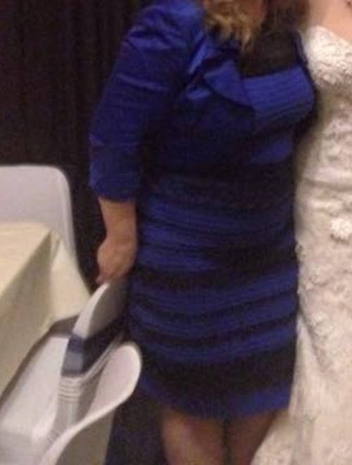 the image here shows a dress that is light blue with brownish-gold lacings  the hex values are not the same because novice digital photography has overexposed the lighting  thats more like it
6990
« on: February 27, 2015, 12:44:12 AM »
there are no such things as real colors
Pages: 1 ... 231232233 234235 ... 502
|


